Time to modernise the look and feel of this prominent wealth advisory business.
The old website was looking rather outdated and it was time to bring the busines sin line with it’s competitors.
Website Development
UI design
The Analysis
The boating imagery of the old site was looking too old school.
Analysis
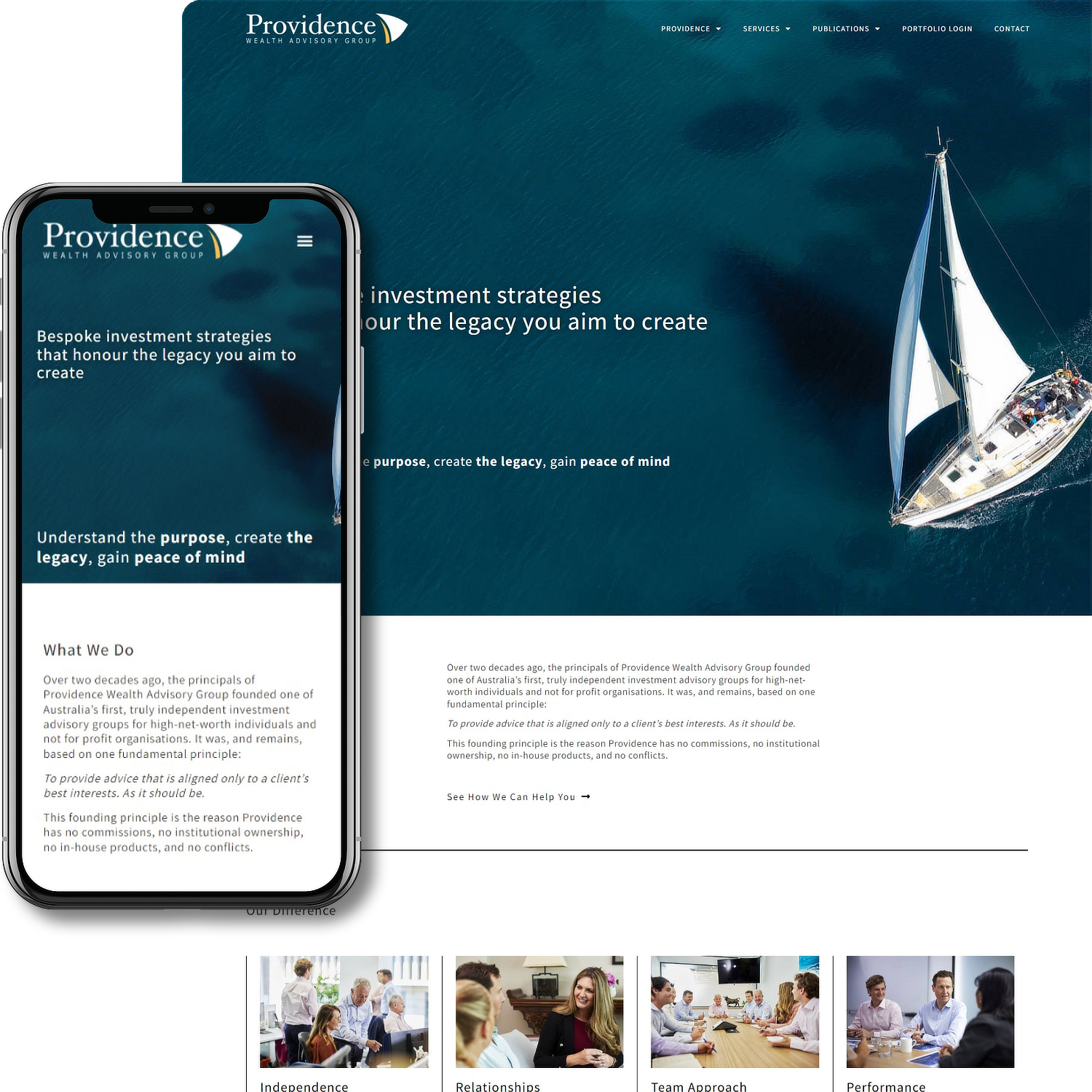
The old website from a design point of view was rather cluttered and bloated with content. The design was looking dated and the imagery needed updating.
The content needed was bloated and needed to be more streamlined, focused and un-cluttered in terms of navigation.
The Solution
Clean layouts, streamlined content and navigation were the key improvements.
Solution
The overall look and feel of the site was modernised with layouts using strong alignment and plenty of ‘white space’ to allow the content to ‘breathe’ a little.
Although the new site retains the boating theme of the old, updated images were used throughout to keep it fresher and more modern looking.